At this time last year the Yankees had a big problem on their hands. Their third baseman and best hitter had just undergone surgery to repair a torn labrum in his hip. He’d miss at least a month, and after that would need time to work back into playing mode. His spring training was essentially his rehab process, which deprived him of at-bats against live pitching. Still, a recovering A-Rod is better than a healthy Cody Ransom, so the Yankees were glad to have him back.
By the numbers, the injury seemed to only affect A-Rod’s batting average upon his return. From May 8 through the All-Star break he hit .256/.411/.548. His power was clearly there, as his .292 ISO shows. Still, there had to be concern about that low batting average. A-Rod was a career .306 hitter heading into last year and had hit .302 in 2008. While he did compensate with an OBP and ISO that outpaced his career marks, A-Rod’s value comes from his all-around abilities. Taking away the hit for average tool would not be good news.
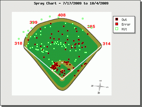
Here’s his spray chart from May 8 through the All-Star break:

The distribution seems relatively even, though it looks like everything he hit to right field went for an out. This might signal a pull tendency from A-Rod, but you can see in this chart that pitchers definitely pitched him inside, presumably testing that hip. There’s also a typical cluster down and away. Perhaps A-Rod was just chasing that down and away stuff, leading to poorly hit balls to right, thus explaining the trend we see on the spray chart.
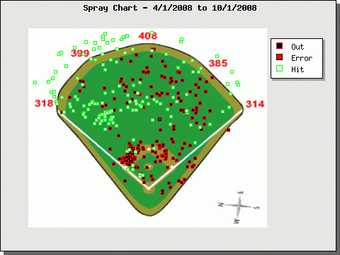
Before going to A-Rod’s post-break spray chart, let’s see how he fared in his mostly healthy 2008 season:

That appears to be awfully similar to the pre-break 2009 chart. Pitchers’ tendencies to pitch him inside also remained consistent. This is where Hit F/X will come in handy. Instead of having a simple breakdown of where balls in play landed, we’ll see how hard each ball was hit, and at what trajectory. That might explain why A-Rod’s batting average dipped markedly while his spray chart looked pretty much the same.
Now for the post-break spray chart:

And, again, we don’t see too much difference here, either. The field looks more filled-in because A-Rod got more post-break at bats. It also seems like he dunked in a few more hits to shallow center. Yet despite the similarities in his pre- and post-break charts he hit .310/.394/.518 in the second half. His power fell off as his average rose and OBP dropped. Again, it seems like there were other factors, such as trajectory and velocity, that played into A-Rod’s performance, rather than where he hit the ball.
Just to get a better look, here’s A-Rod’s 2009 chart:

Look at the 2008 and 2009 charts next to each other if you can. I wonder how much of the difference comes from playing in a different home park with different power alleys. That’s certainly something to consider in this case.
Leave a Reply
You must be logged in to post a comment.