When the Yankees and the Red Sox face off in a few hours, those watching in the New York area will tune into the YES Network as the Yanks begin their title defense. Instead of the familiar YES graphics, however, we’ll see something new. For just the third time since its launch in 2002, the YES Network has overhauled its in-game graphics, and the network – RAB’s partner – gave us a sneak peak at the new look.
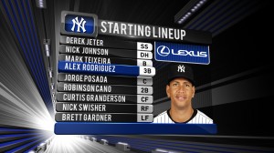
Designed by the Venice, California-based design firm MFactor, the new graphics carry with them a more sophisticated look and incorporate 3-D effects. MFactor and YES worked together over the off-season to redesign the in-game presentation while retaining familiar elements, such as the Yanks’ colors, in the broadcasts. “We wanted to try to separate ourselves from the rest of the pack,” Jared Boshnack, a YES producer, told me.
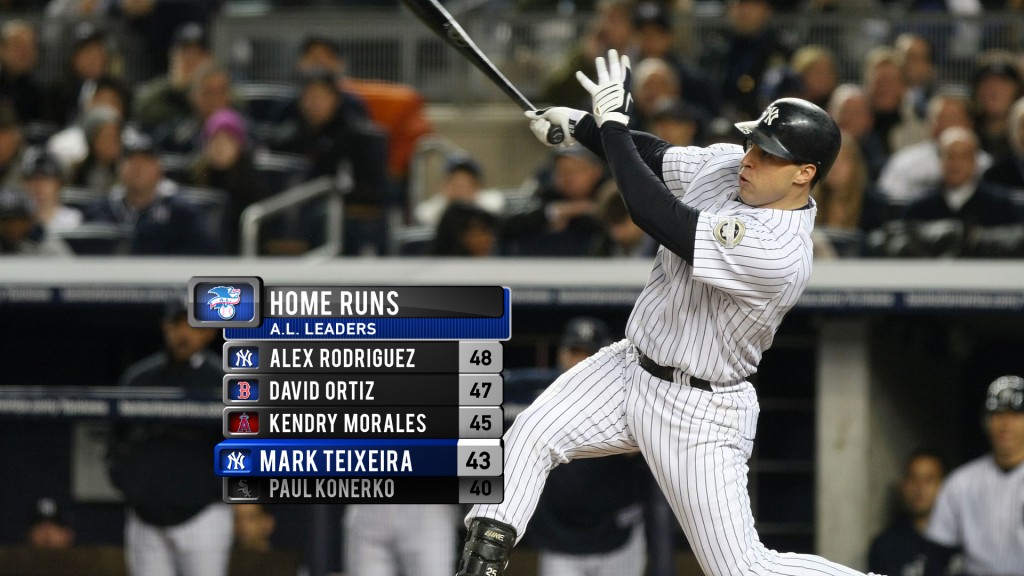
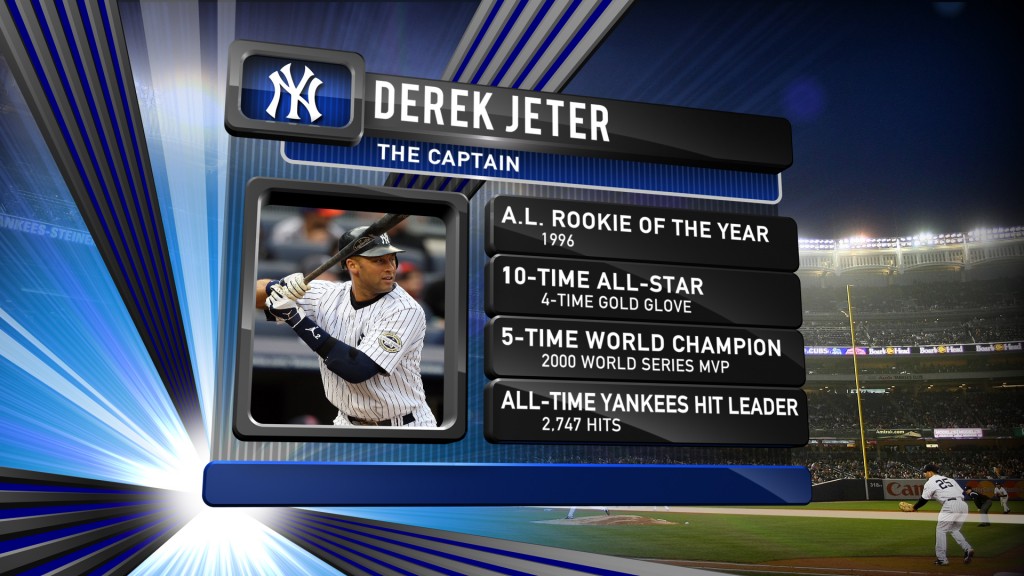
The most obvious change in the interstitials will be the 3-D look. As the lineup at right shows, the names of highlighted players will now extrude as the announcers discuss these players. It’s a far cry from the two-dimensional focus of YES’ old graphics package. “The graphics,” Boshnack said, “essentially pop out at you.”
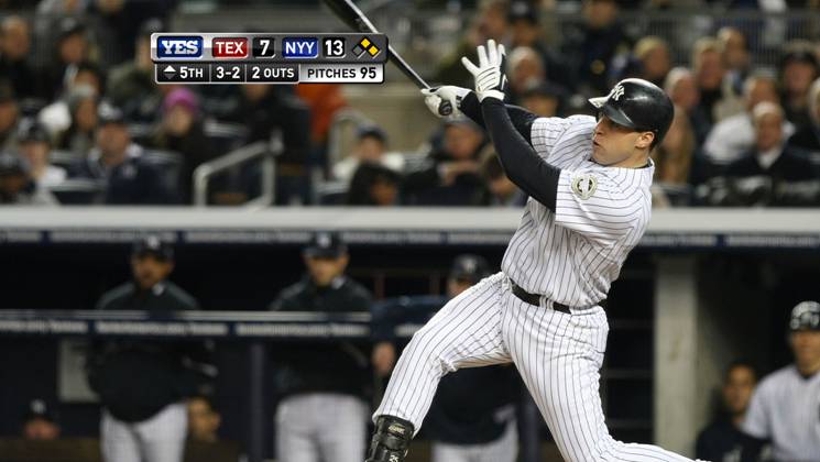
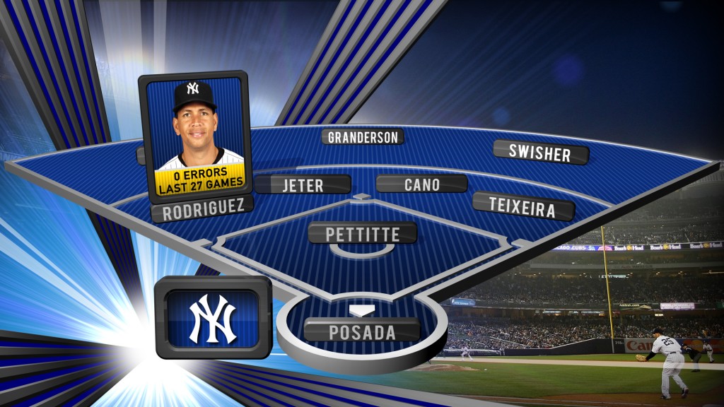
Another obvious change that viewers will notice right away are the changes to what those in the industry call the lower thirds. While the interstitials ? the lineup, the defense array, scouting reports ? are on the screen for 15-20 seconds, the lower thirds are either on the screen for much longer or just a few seconds, and as such, three-dimensional graphics would be both distracting and unnecessary. Instead, YES and MFactor have streamlined the score bar and batting line elements.
The image atop this post shows the new scaled-down score bar. Boshnack called it “totally sleek and much more efficient and streamlined.” It will no longer occupy the entire length of the non-HD broadcast and will instead be off to one side. It will also include a new “Pitches” category that will tally pitchers’ pitch counts after the tenth pitch. When the Yanks are up, the opposing team’s pitcher will have his count there; when the Yanks are in the field, the Bombers’ starter will be inch ever upward. As fans are more attuned to importance of pitch counts, this addition will enhance at-home viewing.
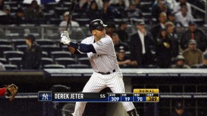
For the hitters, the batting line gets a refresh as well. It’s not nearly as drastic an overhaul as the score bar received, but it does offer a more condensed look. I’d like to see a players’ slugging percentage added to the line as well, but the presence of on-base percentage in TV broadcasts has been a step in the right direction.
Of course, as with any graphical overhaul, MFactor and YES, with Rick Deutschman managing the graphics team, considered the way sponsorships will be front and center in the look as well. Boshnack said the design teams asked, “How do we give them the exposure they’re looking for and integrate them into the look?” Such are the demands of baseball economics.
Overall, I think the graphics are an improvement. I’d love to see more information available during the broadcast, but I realize that I watch many games with the Internet at my fingertips. TV stations face a balancing act between a good look for their graphics and the right amount of information. After the jump, a few more screenshots. Click to enlarge.
Leave a Reply
You must be logged in to post a comment.