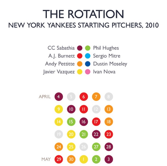
Earlier this week, Craig Robinson at Flip Flop Fly Ball posted a chart of the Mariners’ 2010 rotation, and I fell in love. The Flip Flop Fly Ball artist broke out the months of baseball schedule into five-calendar-day rows, and he used color coding to show when each pitcher had the ball. He also produced a similar chart for the 1971 Orioles’ four-man rotation.
In one sense, the idea behind the chart is simple: If a team maximizes its best pitchers, their color should show up once per row. So if the 2010 Mariners wanted to get the most of Felix Hernandez and, in the early going, Cliff Lee, the light blue and dark purple would appear every week.

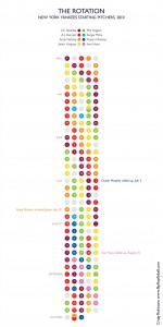
I asked Craig to do the same for the Yankees last year, and he produced the chart excerpted above. You can view the entire thing by clicking on the image at right. I find this chart to be mesmerizing, and from it, we can draw a guarded conclusions. Had the Yankees stuck with a strict rest schedule for CC Sabathia, they could have coaxed three additional starts out of their ace last year. Because of off days and the desire to keep every other pitcher on target, CC “missed” his starts during the five days beginning May 24, August 2 and October 1.
Of course, that raises another question: Should the Yankees disrupt their other pitchers to make sure their ace gets as many innings as possible? On the one hand, I’m tempted to say yes. After all, Sabathia is that much better than the other Yankee hurlers, and he’s a workhorse. He can shoulder the innings, and he’s happy to take the ball. The AL East last year came down to one game, and it’s not a stretch to say that an additional three Sabathia starts could have given the Yanks the division crown.
On the other hand, these players need their rest. Sabathia could have made a total of 37 starts last year, but in today’s age of pitch counts and innings caps, that is probably an excessive number. If the Yankees want him fresh for the playoffs, they’re willing to give him a few extra days as the schedule dictates. That’s just the way the game is played.
Anyway, I found this chart to be a wonderful way to understand the way the pitching rotation shakes down over the course of the year. After Opening Day and before the playoffs, labeling pitchers based on their spots in the rotation is largely meaningless. When you’re done pouring over this one, check out Craig’s site. His infographics will soon be available as a book, and I’m looking forward to getting my hands on that one.
Leave a Reply
You must be logged in to post a comment.